When the Chart Is Just Wrong; What a Market Cap Visualization Taught Me About Iterating with AI
I started with what seemed like a simple ask, a scatterplot comparing the largest US companies by market cap in 2005 versus 2025, with tech companies in one color and everything else in another. What I got instead was a master class in what productive iteration with an AI tool actually looks like...
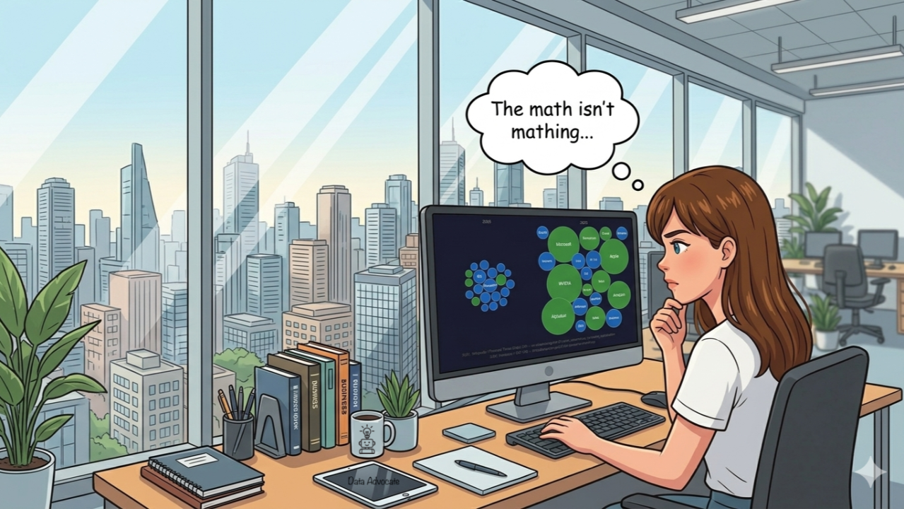
I started with what seemed like a simple ask, a scatterplot comparing the largest US companies by market cap in 2005 versus 2025, with tech companies in one color and everything else in another. What I got instead was a master class in what productive iteration with an AI tool actually looks like, and what it requires from the human in the loop.
The first chart worked. The second request, to convert the scatterplot into a bubble chart where size corresponds to market cap, is where things stalled in the least glamorous way possible. First, the chart failed to render, then it rendered black, then the bubbles overlapped so badly the visual was unreadable. Each failure required a different diagnosis, and each fix revealed a new layer of the problem. Chart.js gave way to a pure canvas drawing approach. Explicit background fills replaced CSS inheritance. A physics-style collision resolver running 600 iterations pushed the bubbles apart. By the third or fourth attempt, the chart was genuinely good, which was not the same thing as correct.
That distinction matters, and it is the thing I want to sit with here.
The Data Problem Hiding Underneath the Rendering Problem
Once the visual was working, I asked about sources. This is the kind of question that sounds like a formality but is often where the real work begins. Claude cited its training data for the 2005 and 2025 figures and pointed me toward Finhacker, Wikipedia, and the American Business History Center for verification. When I pushed to actually check the data against those sources, a meaningful error surfaced. The 2005 chart had GE ranked first and ExxonMobil second, but multiple sources confirmed that ExxonMobil had overtaken GE mid-year. The figures were in the right ballpark, but the ranking at the top was wrong. (This is a check I have now built into custom instructions for all research tasks).
The chart looked authoritative, the bubble sizes were reasonable, and nothing in the visual signaled that the top two entries were transposed. Only the follow-up question about sourcing opened that door, which is a genuinely useful kind of failure to document.
What the Source-Chasing Revealed About AI Data Retrieval
Trying to pull 2005 and 2025 figures from a single consistent source turned into its own experiment. Finhacker's historical tables are rendered via JavaScript, which means a plain fetch returns nothing useful, and CompaniesMarketCap has the same problem. The data exists and is accessible to a human visiting the page and selecting a year from a dropdown, but it is not accessible to an AI doing a programmatic fetch. Wikipedia's Financial Times data came through as actual text and became the verified anchor for both years.
This is a pattern worth filing away. AI tools can hit walls when data lives inside JavaScript-rendered interfaces, and the honest response is to say so rather than substitute approximations without flagging the substitution. Claude was transparent about this (because I added it to my custom instructions for Claude to "not make up numbers just to make an argument and to flag if a number is exact and sourceable or an estimate and directional"), which made it possible to route around the problem rather than unknowingly publish bad numbers.
The Scale Problem That Changed the Whole Story
After the data corrections, I asked for something more ambitious, two charts where the bubbles are drawn to a true shared scale, so the 2005 companies appear at their actual size relative to 2025. The combined market cap of the top 20 US companies was $3.2 trillion in 2005 and $29.5 trillion in 2025. When you draw those numbers to the same scale, the 2005 companies are not just smaller, they are nearly invisible next to NVIDIA at $4.5 trillion. The corrected, to-scale version communicated something the proportionally-relative version simply could not. It showed not just that the companies had gotten bigger, but that the frame of reference itself had shifted.
That was the moment the experiment stopped being about charts and started being about the asset I actually wanted.
What I Would Take Away From This Exchange
The rendering failures early in the session are easy to dismiss as friction, but they set up the more important moves that followed. Each failure required a specific diagnosis rather than a general retry, and that specificity is what produced a better output. The same principle applied to the data. Accepting the first version would have meant publishing a chart with the top two companies in the wrong order.
The session also surfaced a limit I had not thought much about before because I am used to doing all of the research. AI access to web data is not equivalent to human access. Sitting at a browser, I could have pulled the Finhacker historical data in two minutes. Claude could not, and knowing that changed how I planned the sourcing.
What Worked
- Iterating on rendering failures with specific diagnostic framing rather than vague "try again" prompts
- Asking about sources as a genuine verification step, not a formality
- Requesting true-to-scale comparison rather than accepting proportionally-relative defaults
- Pushing for a format (transparent PNG) that matched actual end use rather than treating the interactive HTML as a finished deliverable
What Didn't
- My first several requests assumed the data underneath was as reliable as the visual on top
- I lost several rounds to JavaScript-rendered source walls before understanding the structural problem
- I never got the text to render correctly on each bubble and had to use a good old fashioned text box in PowerPoint to address the issue
- I also never figured out how to get the charts to animate properly in the HTML version so it could run in the presentation, PowerPoint animation solved that one in the end. It was not as pretty as it could have been, but it worked.
Key Learnings
- A polished visual creates a false sense of verified data. The chart looked authoritative because the rendering worked, and those are two completely different things.
- Asking for a true-to-scale representation rather than a proportionally-relative one changed the entire argument the chart was making. Default settings have a point of view, and it is worth interrogating them.
- AI access to web data and human access to web data are not the same thing, even when the data is technically public. JavaScript-rendered interfaces are accessible to anyone with a browser and invisible to a programmatic fetch, and that gap is easy to miss until you hit it.
- Specific failure descriptions produce specific fixes. The gap between "the chart failed to render" and "the chart is rendering black because it is inheriting a dark background" is the gap between a productive next step and another generic retry.
Tools Used
Tool: Claude - Where to Find It: claude.ai - Cost: Claude Pro subscription, $20/month